The starting point
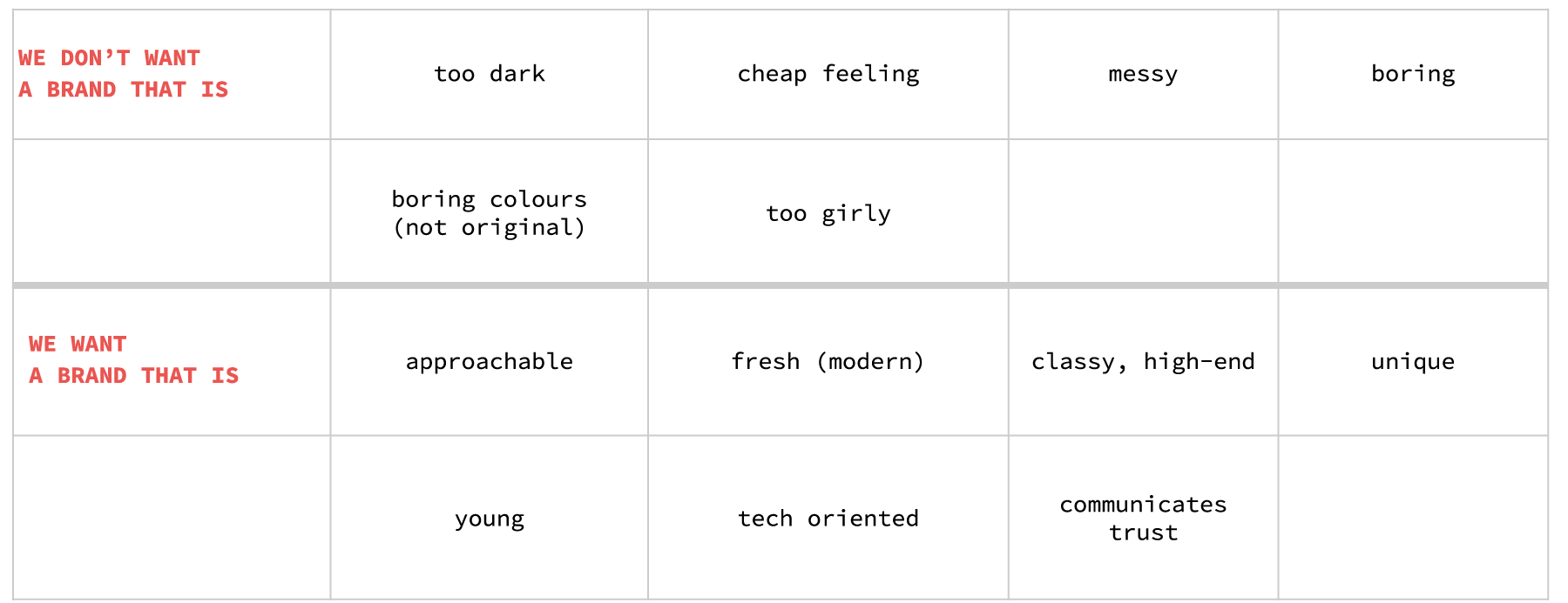
The challenges
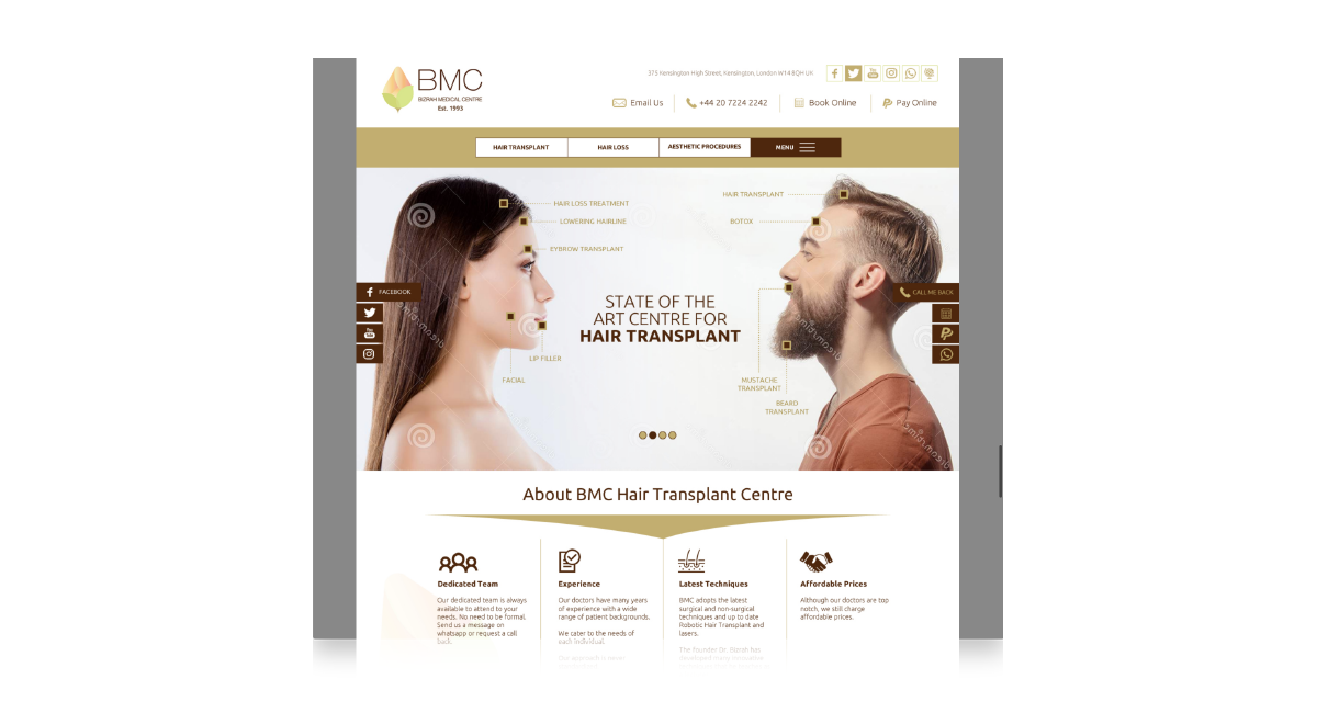
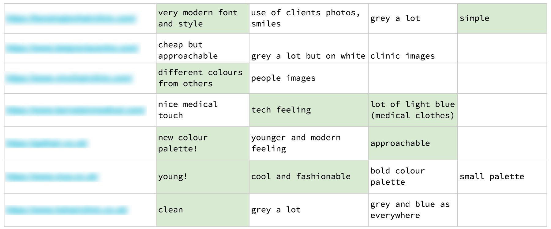
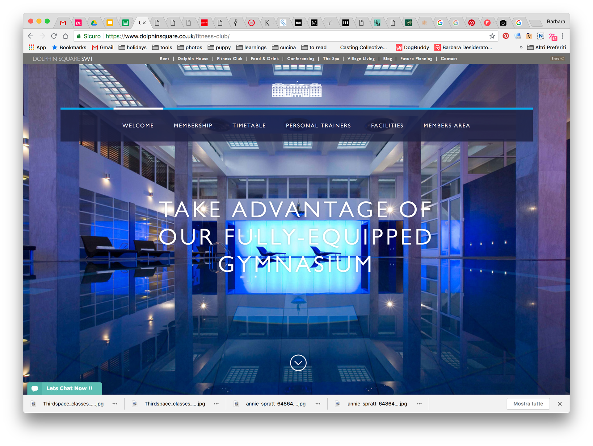
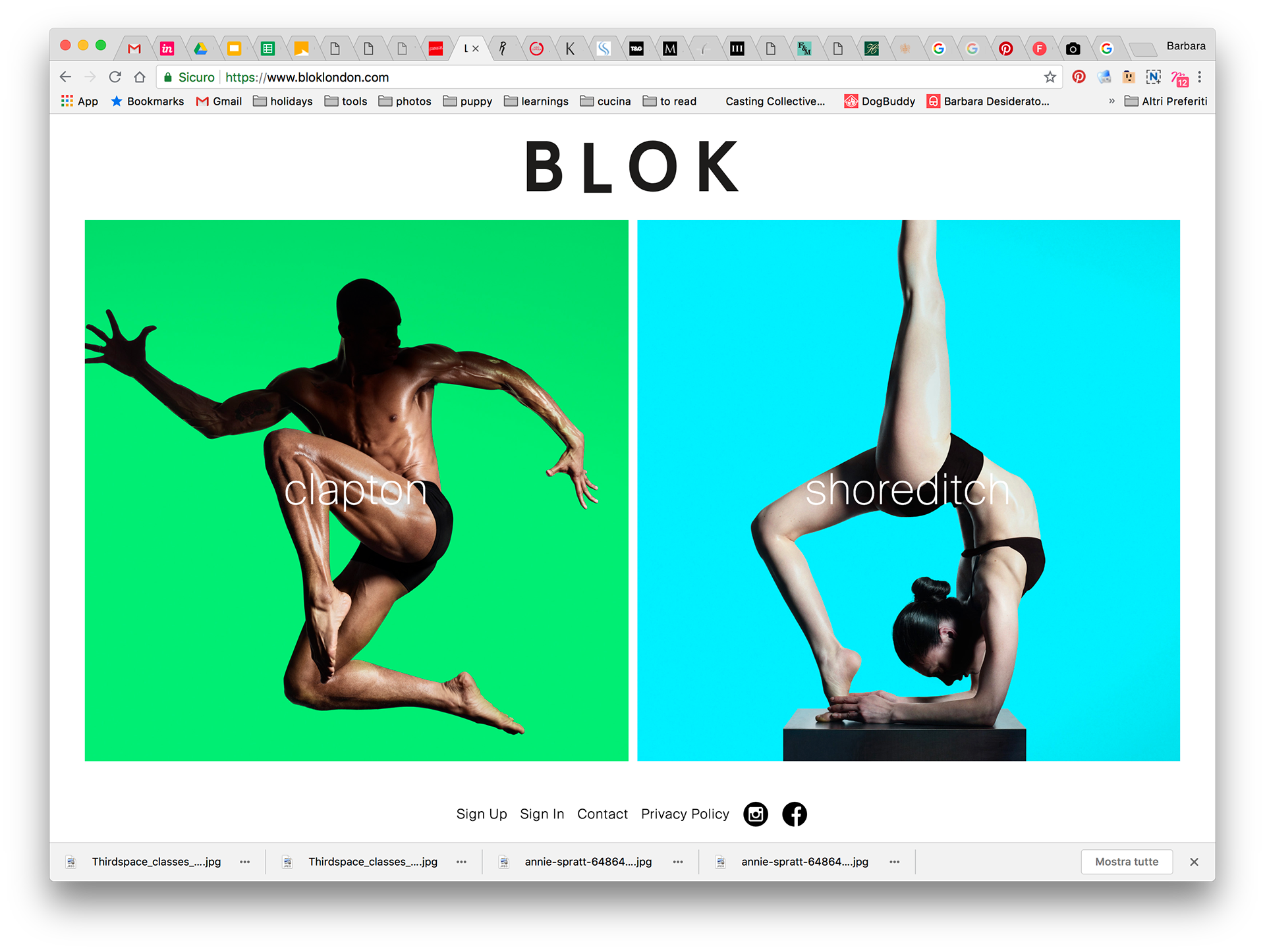
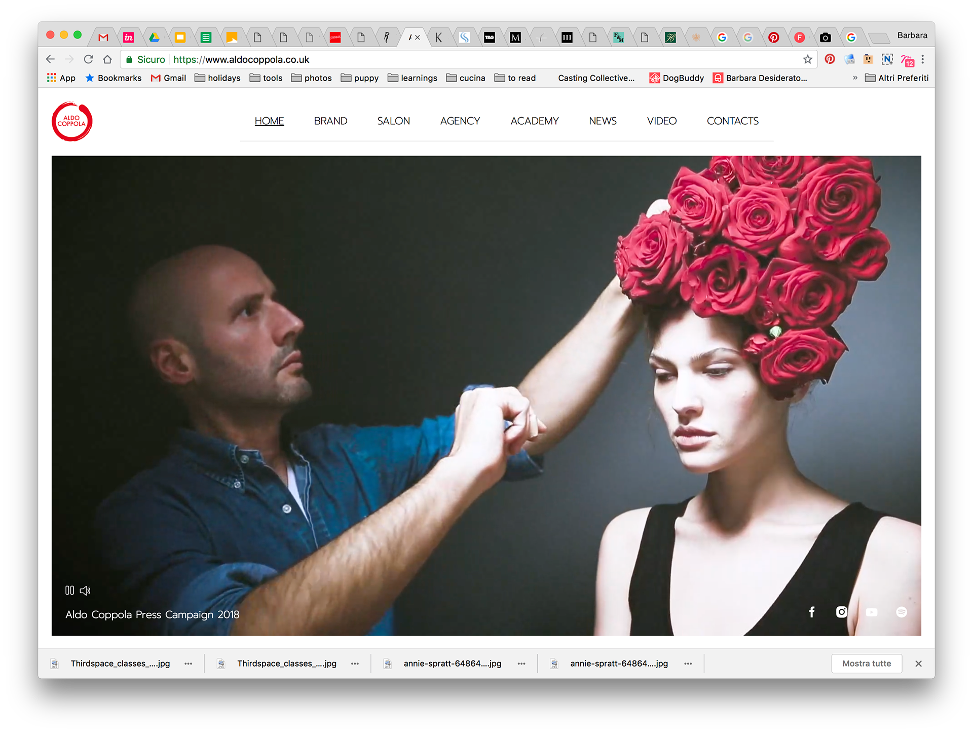
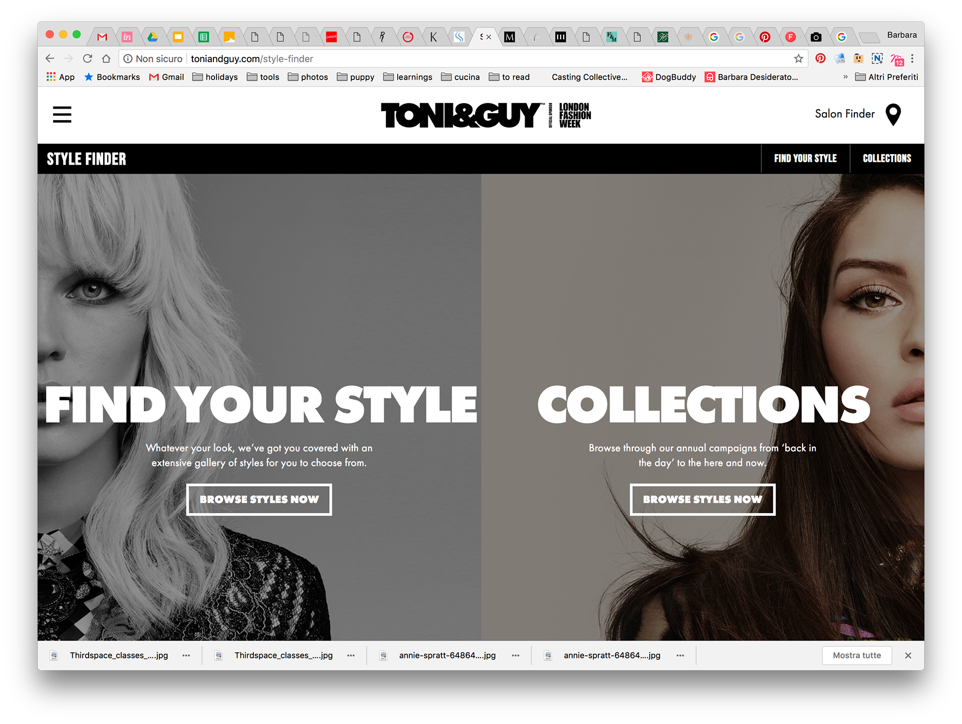
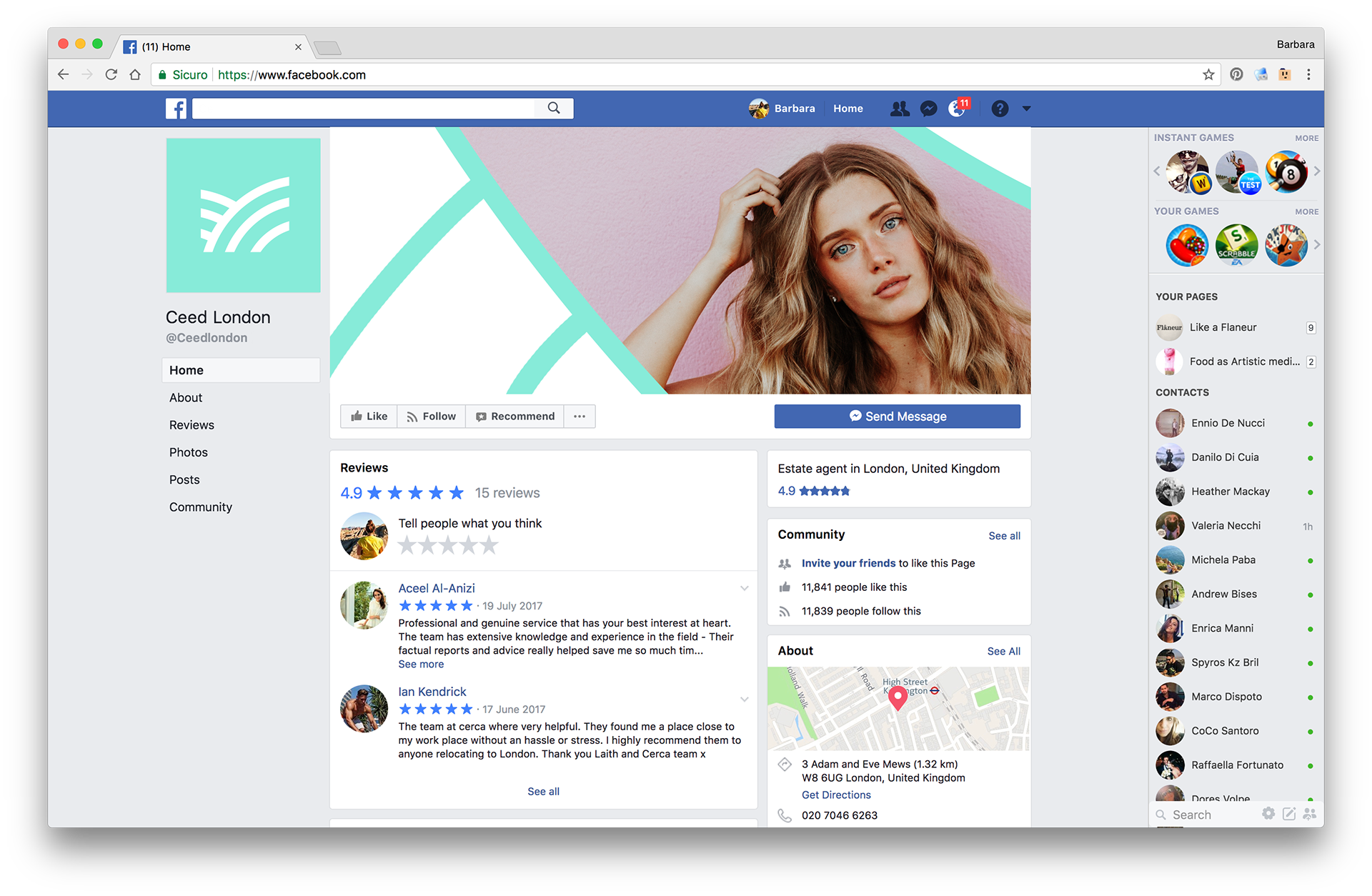
Competitors analysis
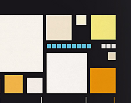
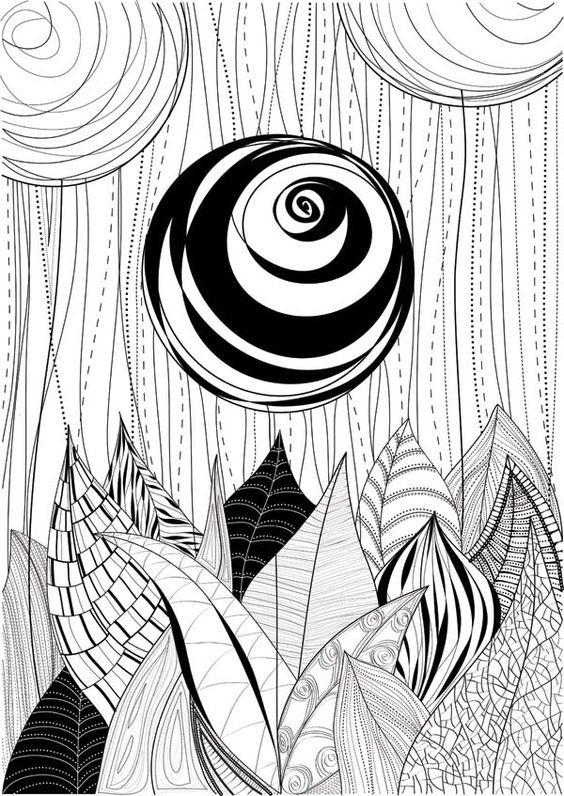
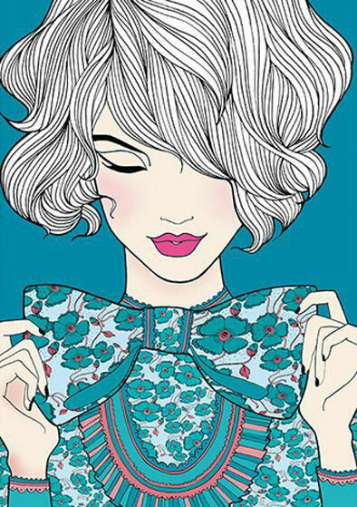
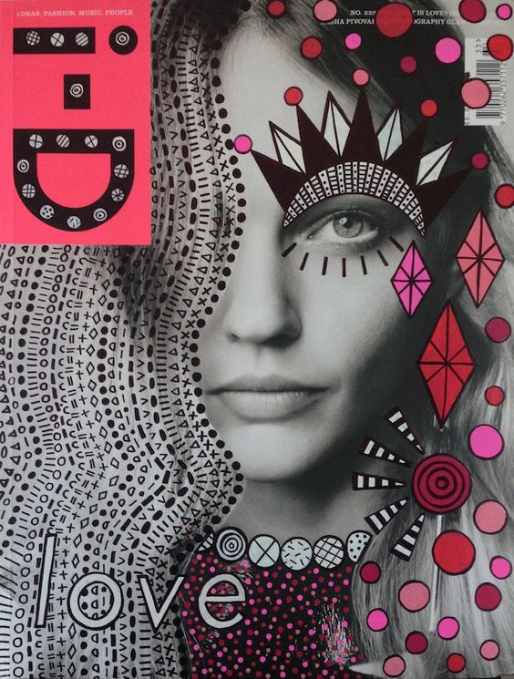
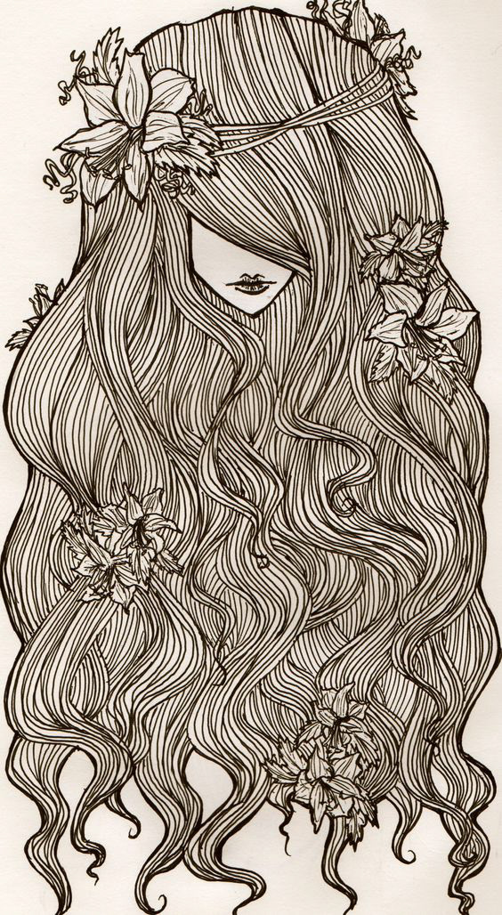
Moodboard
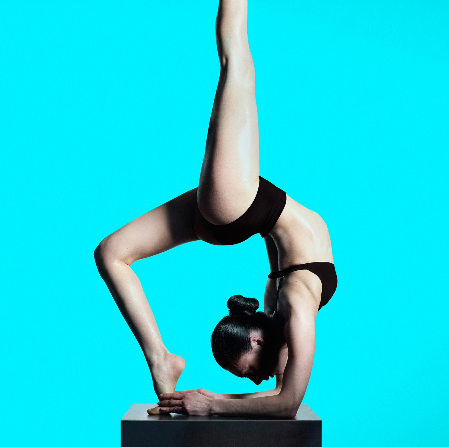
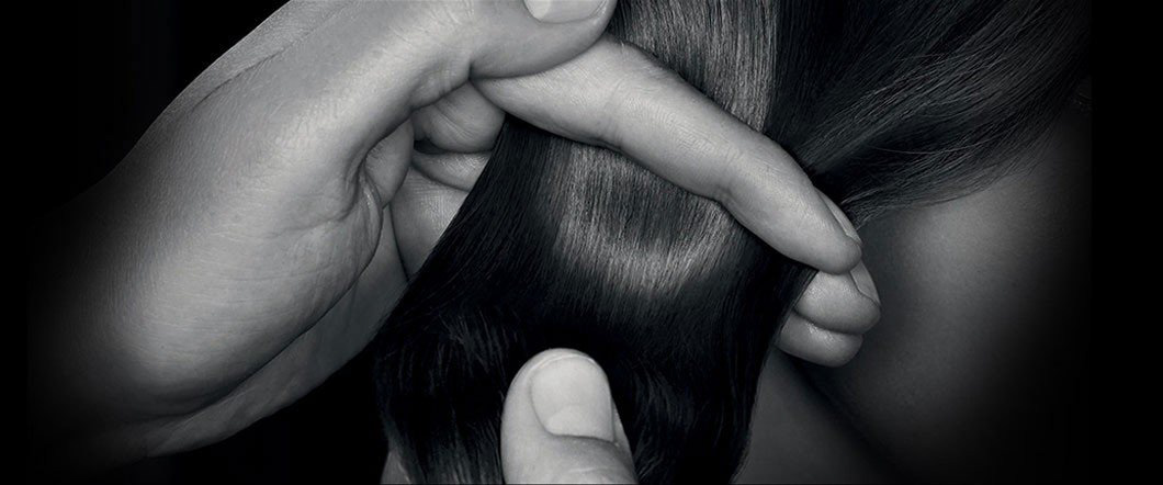
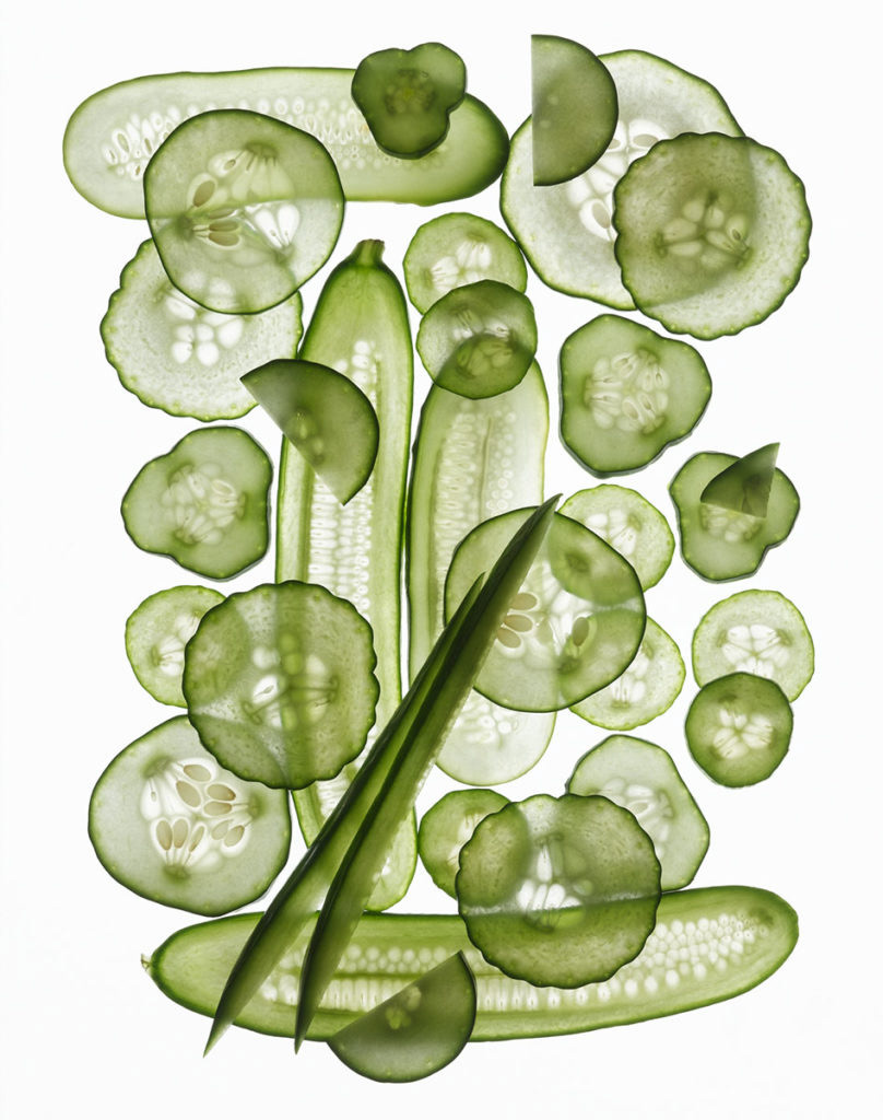
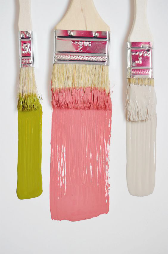
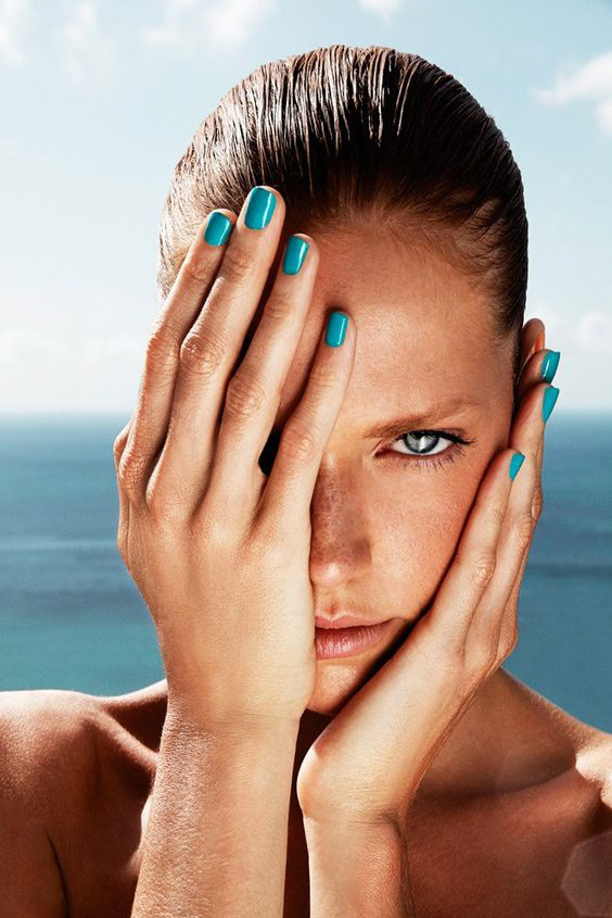
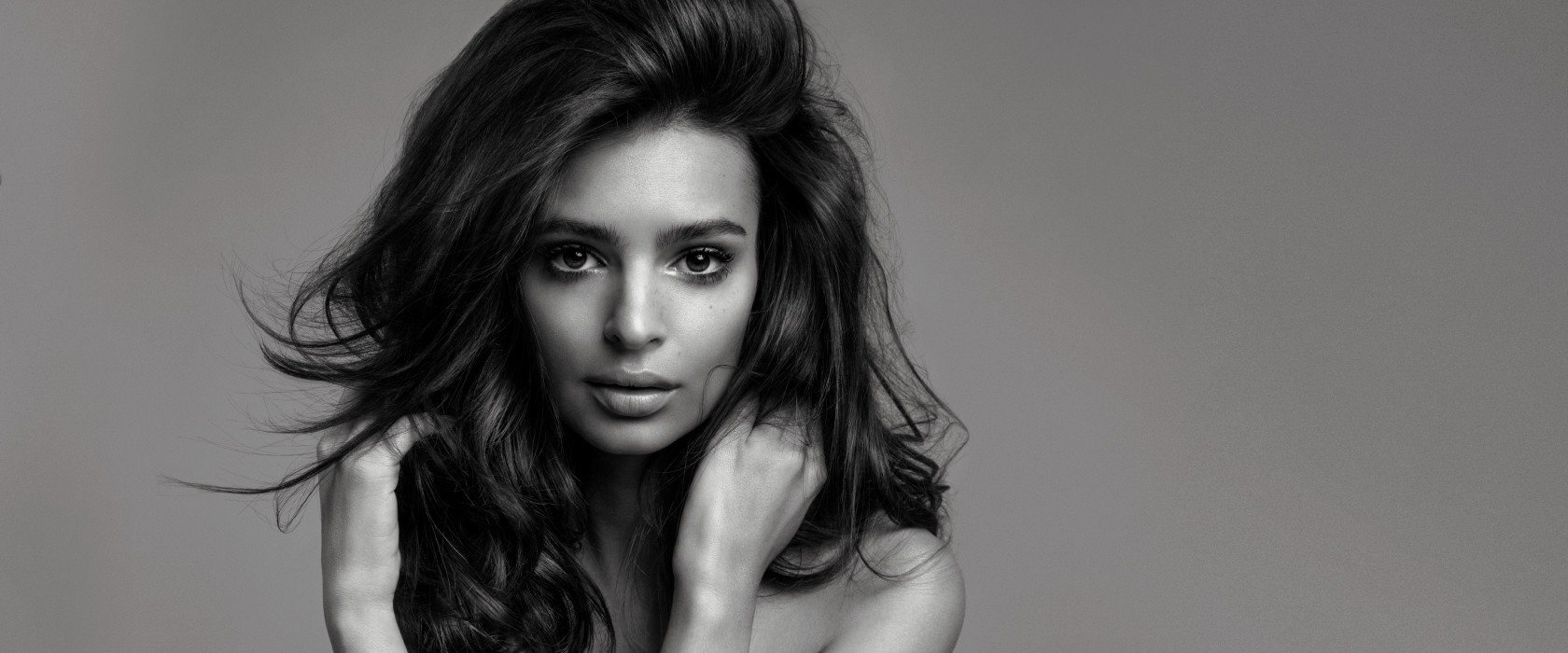
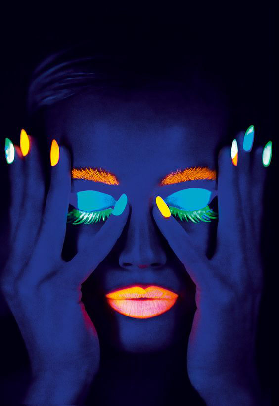
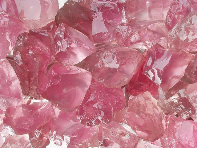
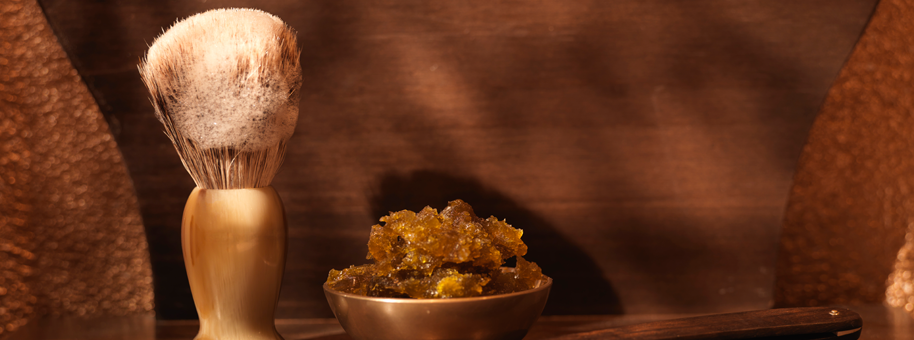
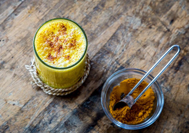
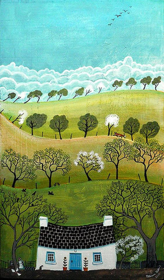
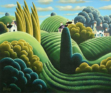
Inspirations
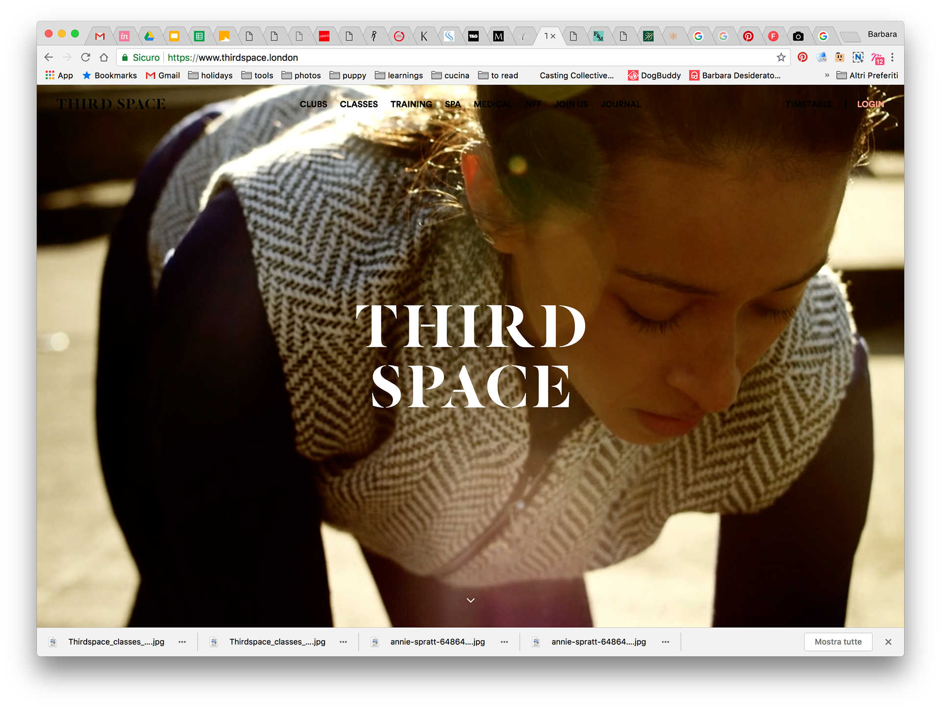
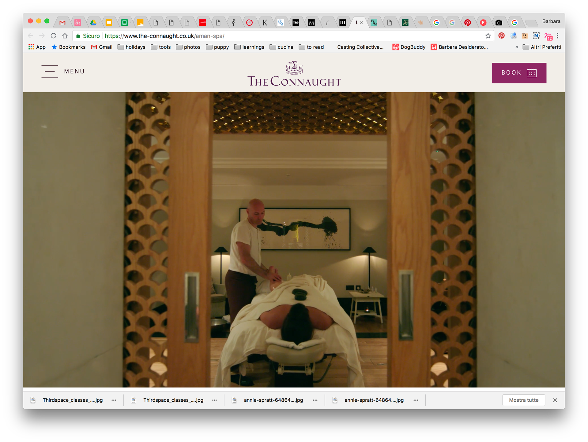
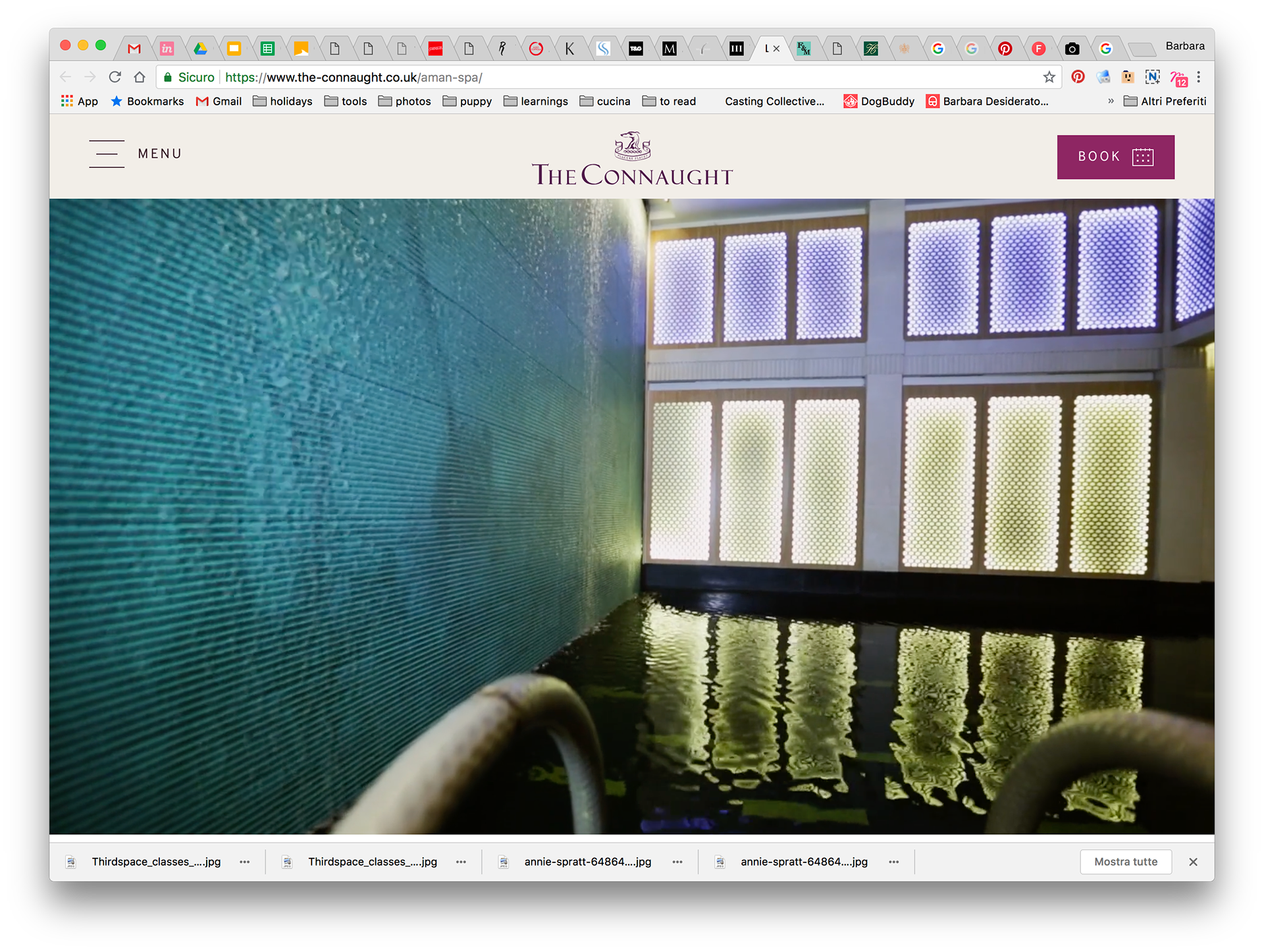
Instead of looking at competitors only, I started looking for inspirations in the wider health&beauty, well-being and luxury industry with spas, fitness clubs and hair salons.
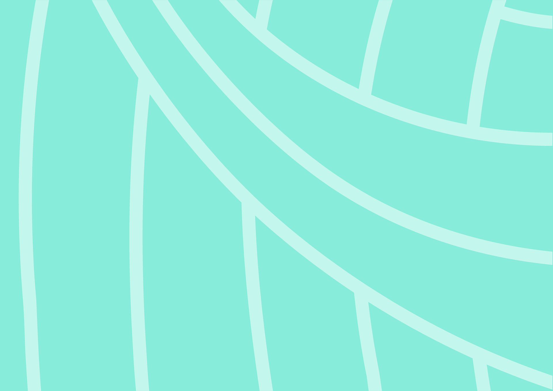
Visual Language concept
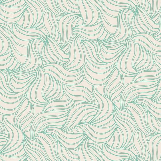

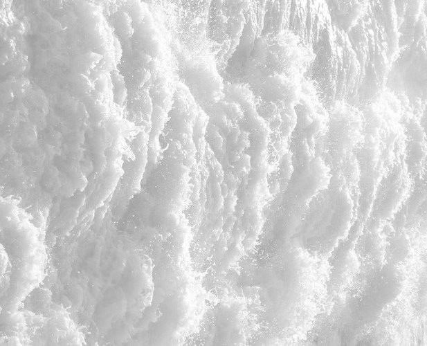
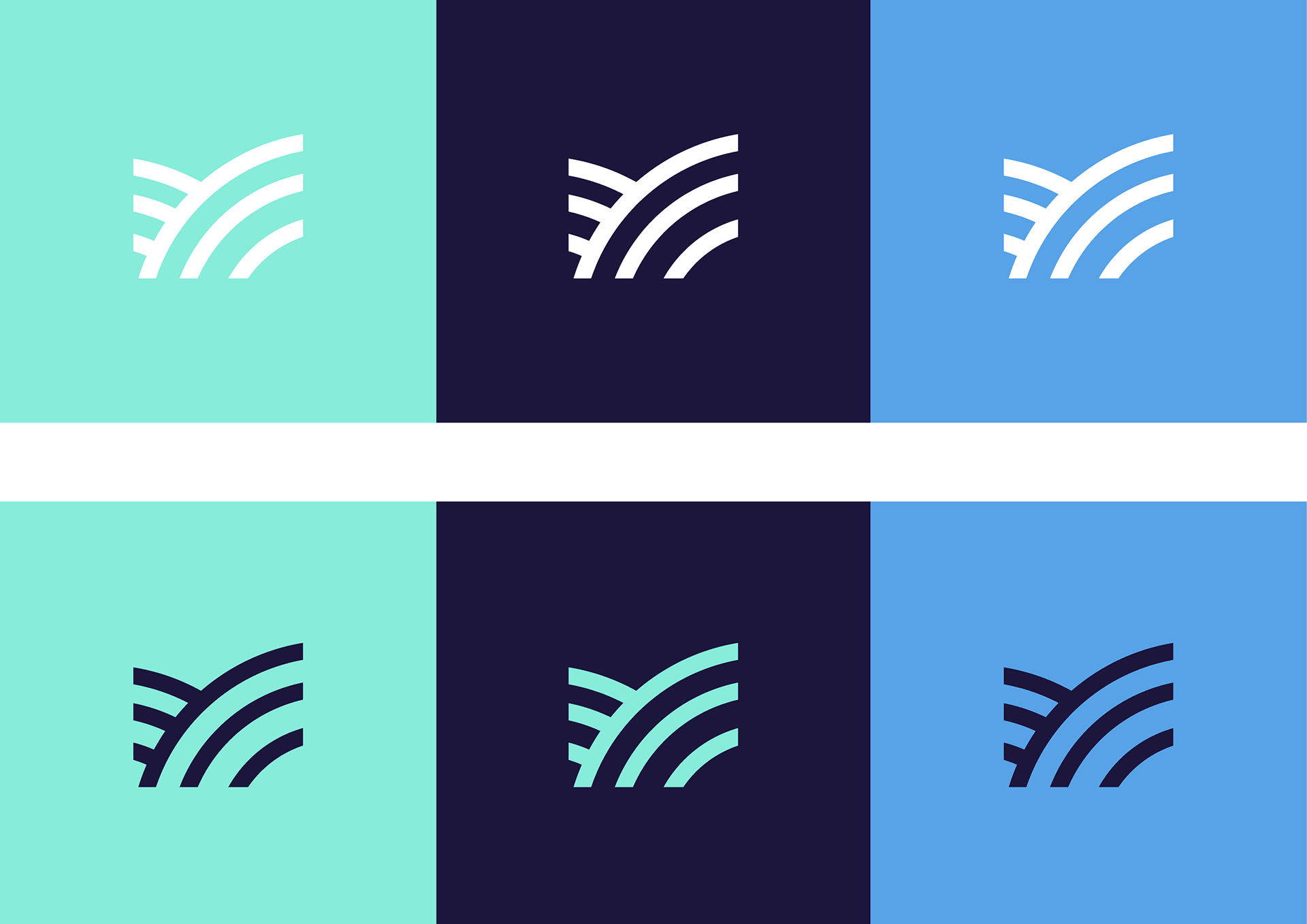
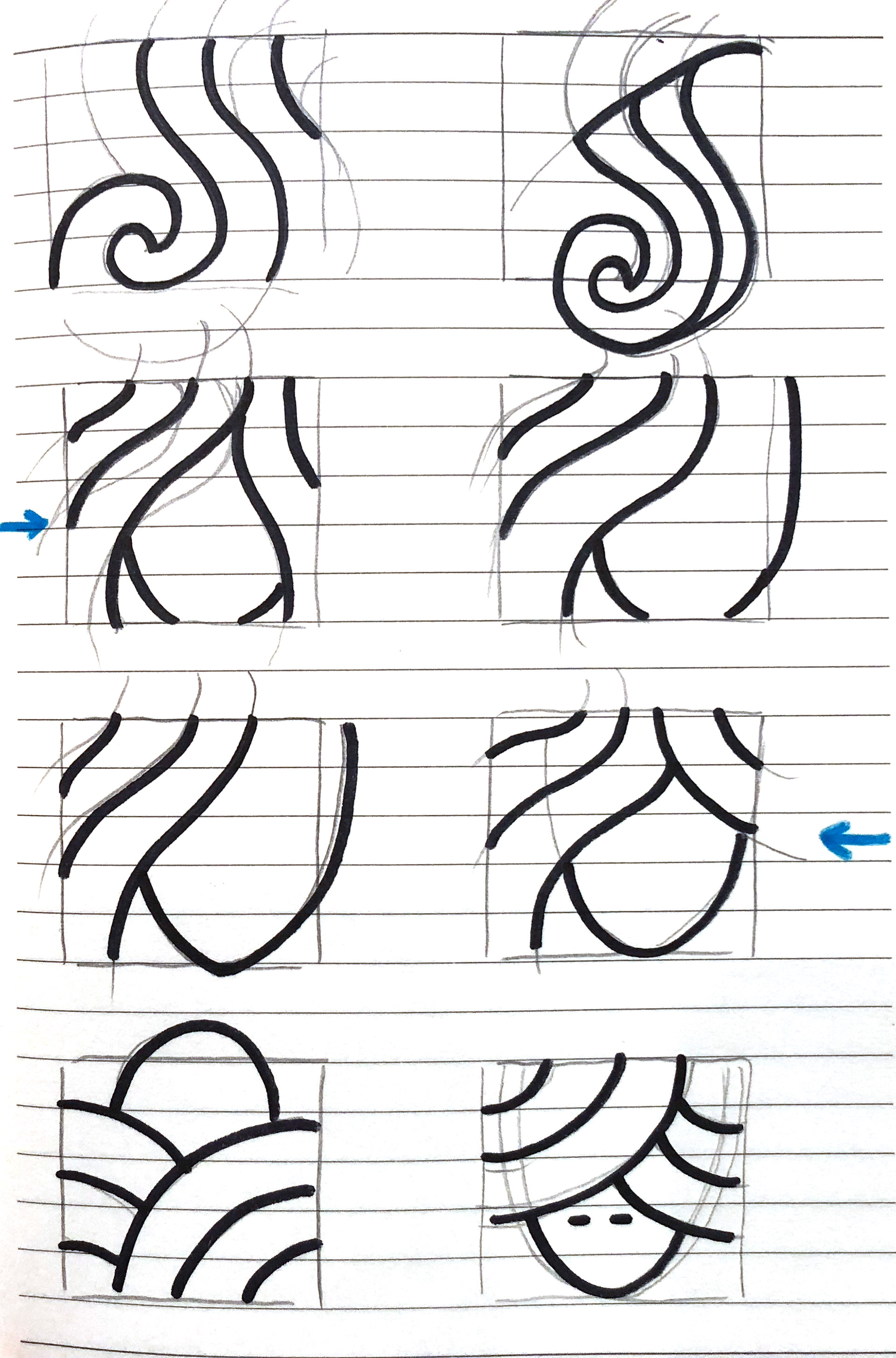
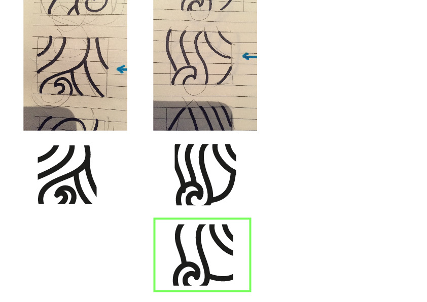
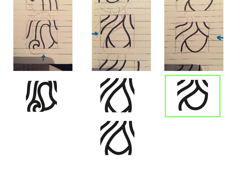
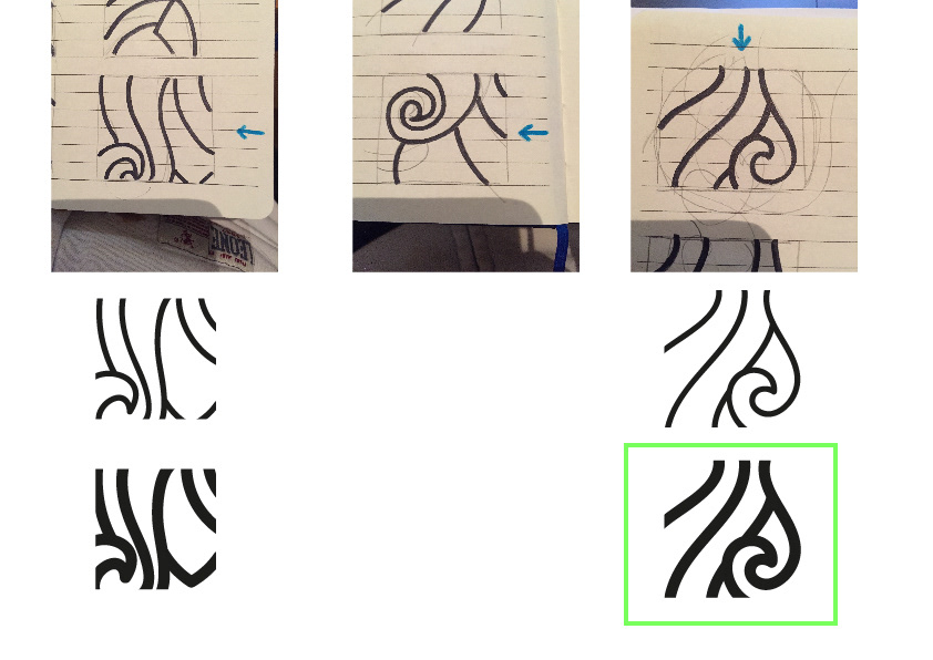
I developed a 'curly' texture that became the matrix for the whole visual language. You can isolate portions of it to develop different variations according to your needs.
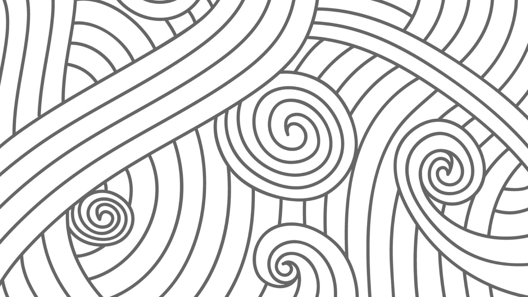
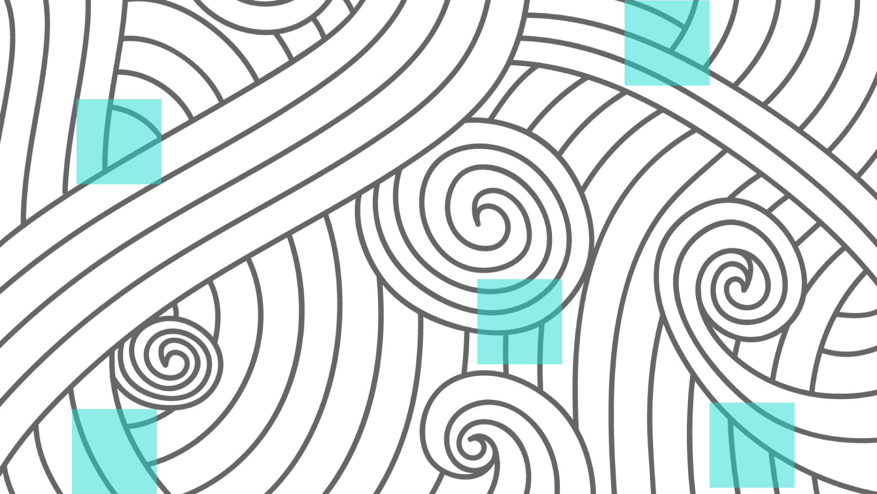
The result is an always changing visual language that stays consistent but is always flexible, producing different textures every time.
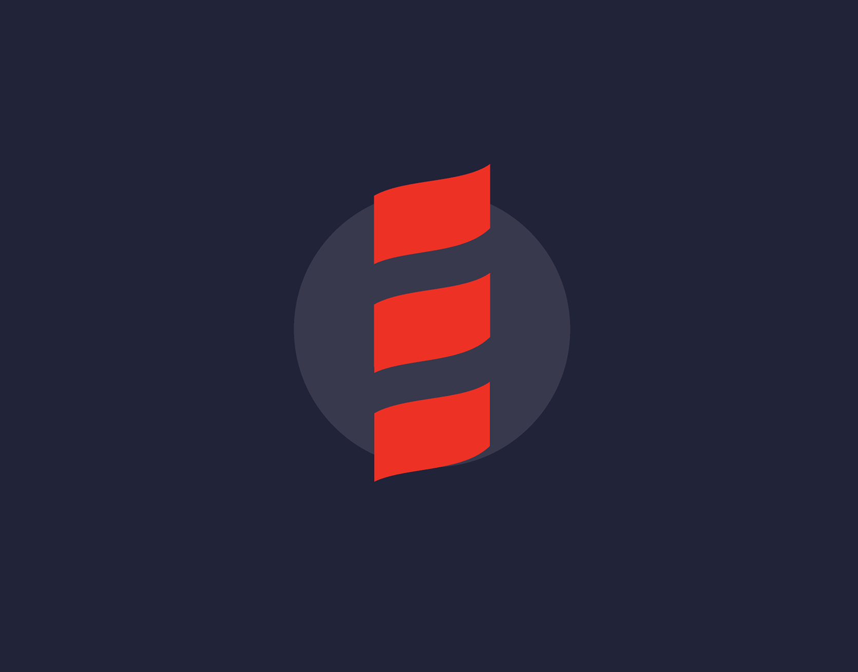
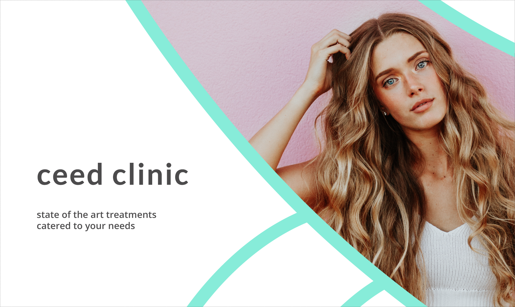
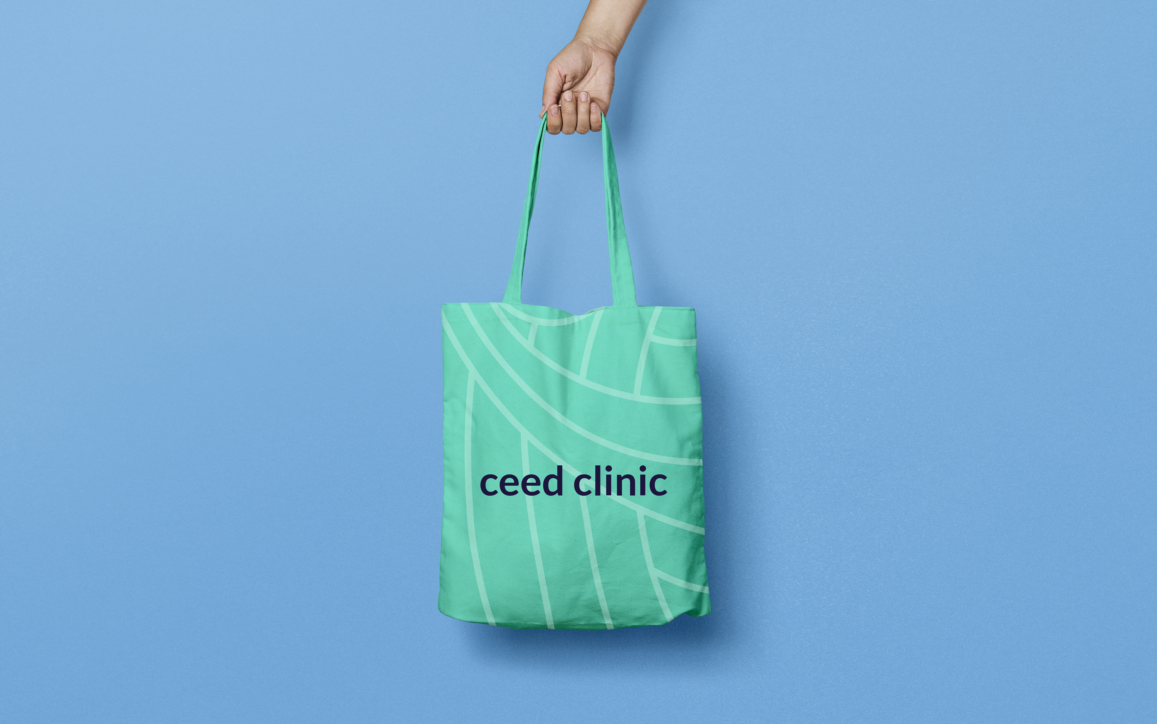
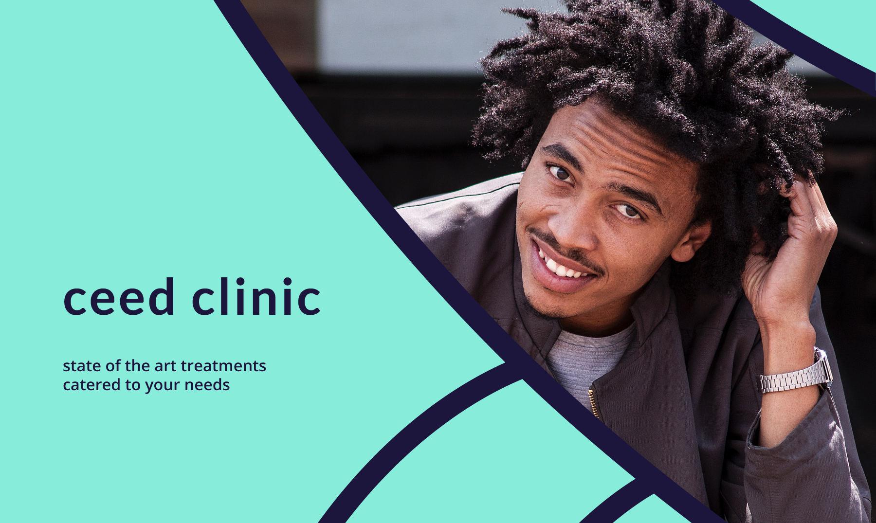
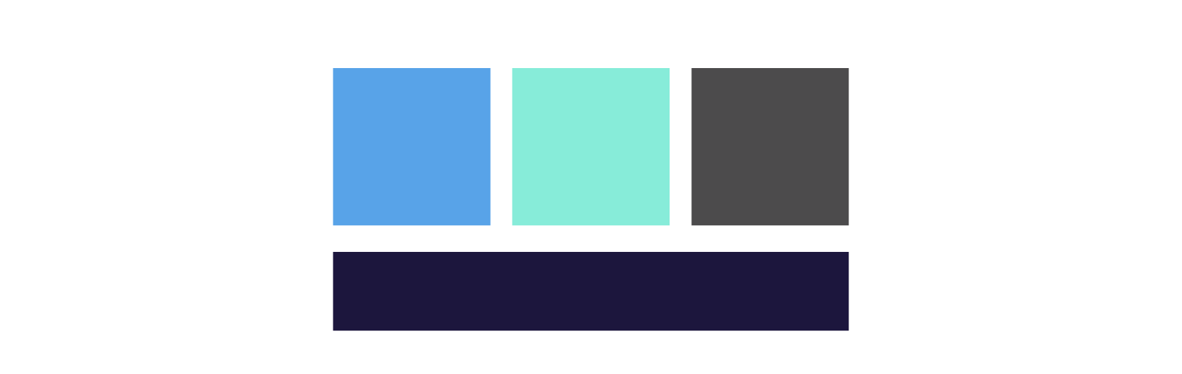
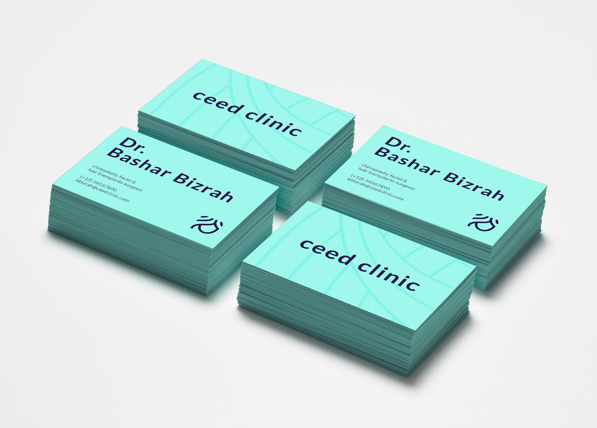
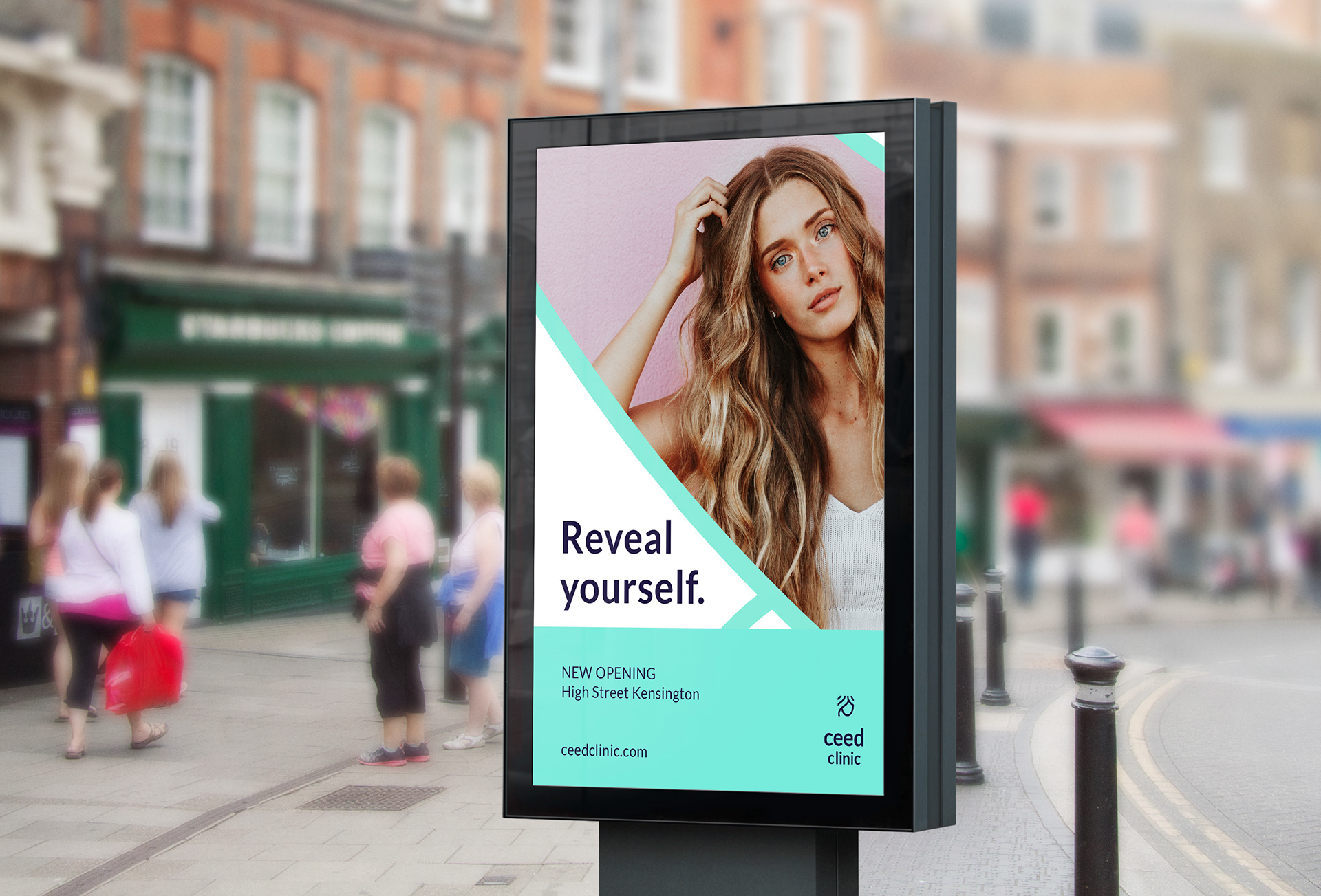
The new brand
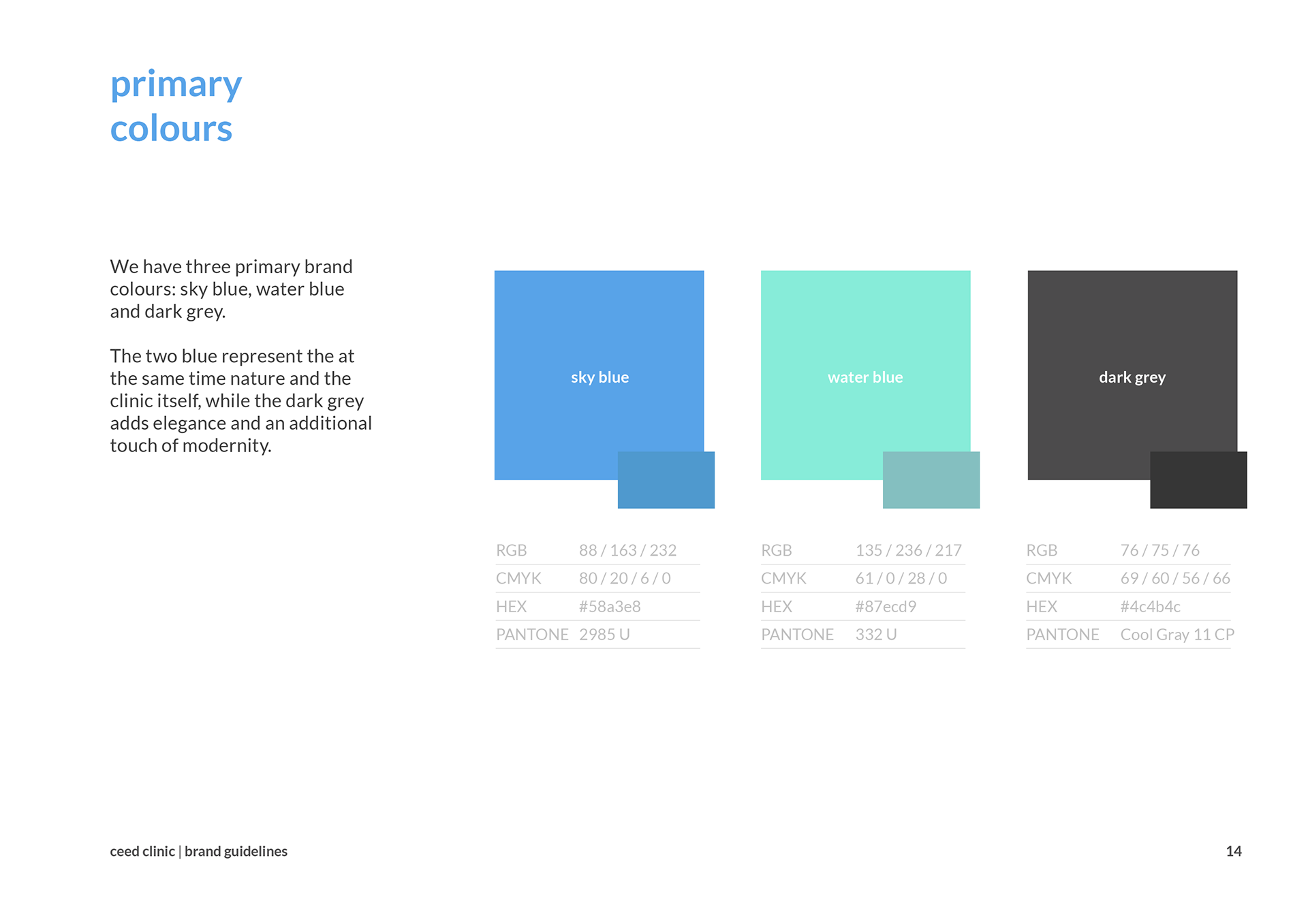
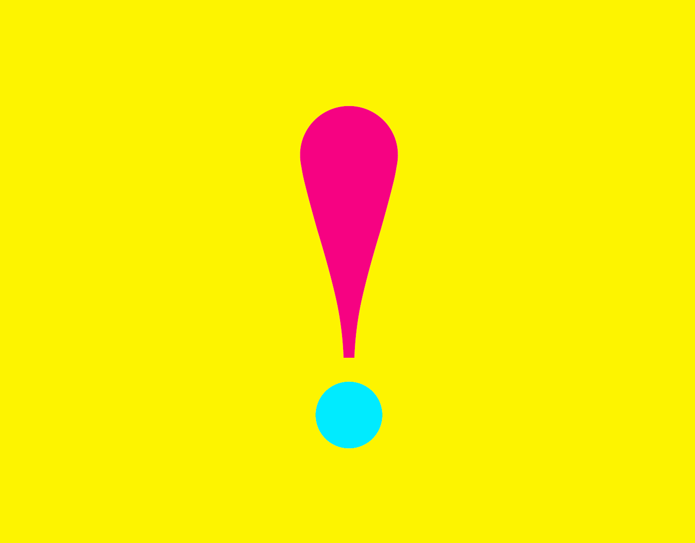
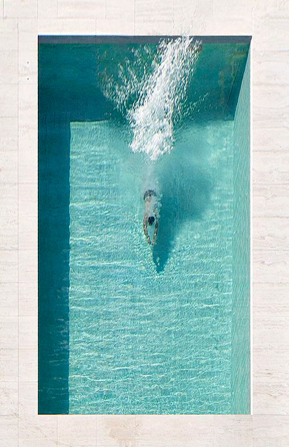
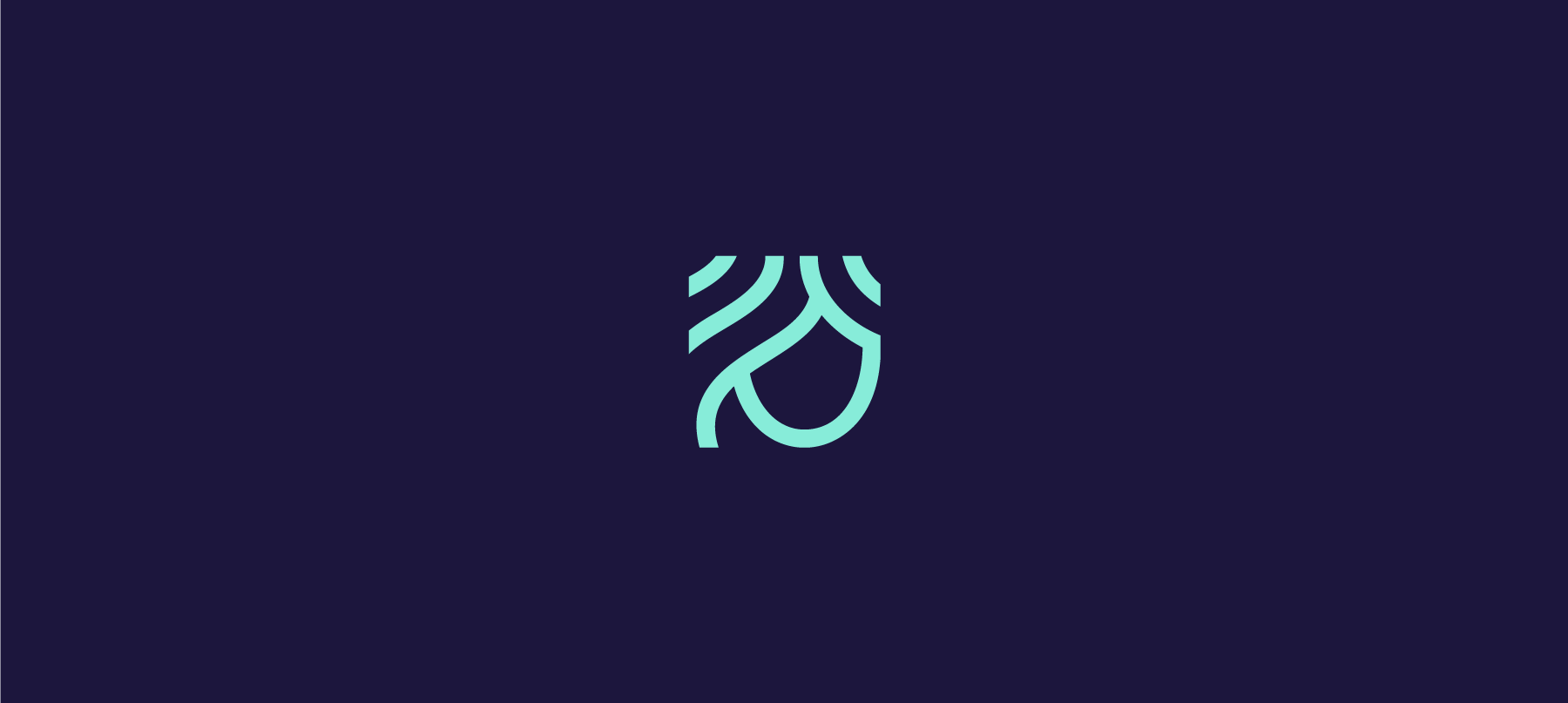
The colour palette is coming directly from the natural world, mainly reminding water but with a modern touch. The symbol too supports this concept, looking like a portion of a waterfall for example. But water is not the only element recognisable in the visual language, the hills and 'leafy' motifs from the moodboard contribute to the general design.
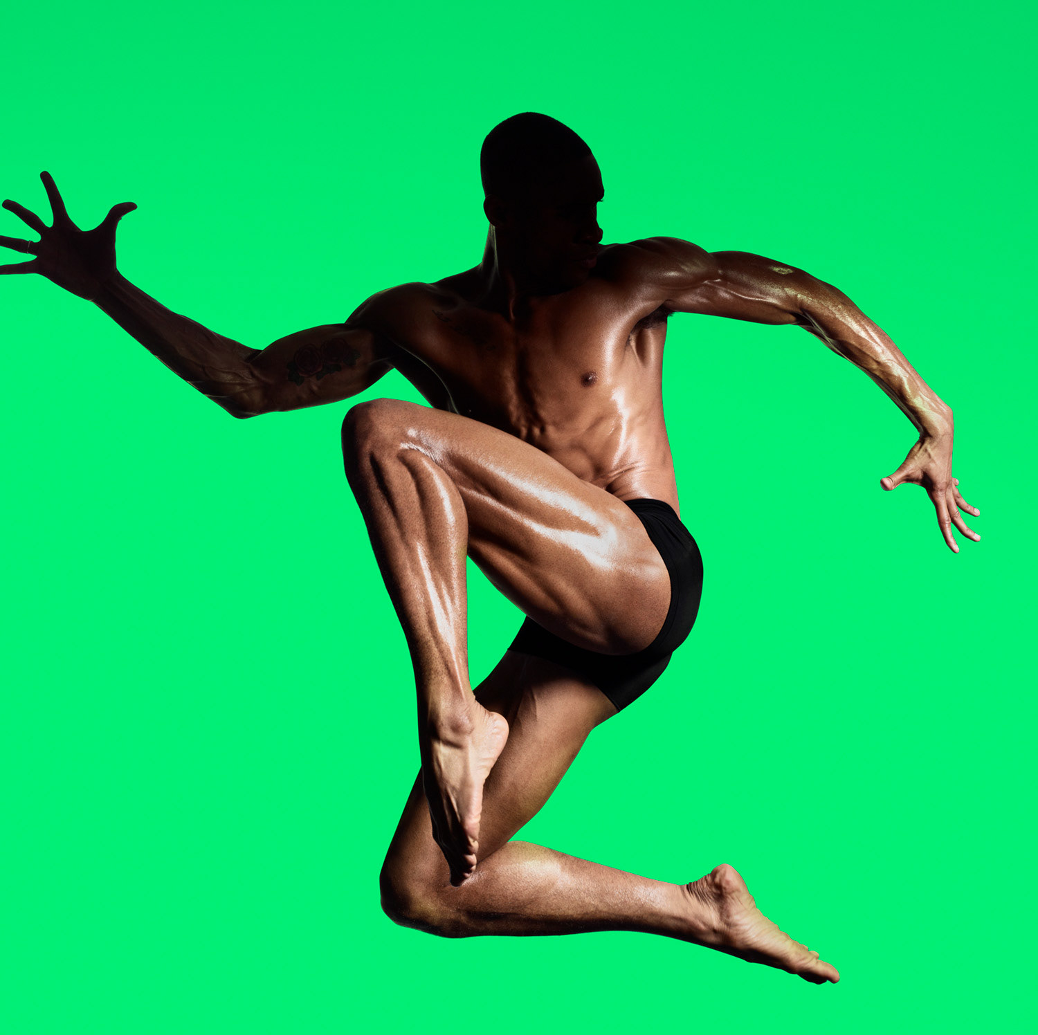
All these choices want to support the natural but technologically advanced services offered by the clinic and make the brand more appealing to a younger audience.
Different tests and comparisons were needed in order to make sure that such a bright palette could be easily used and translated when printed.
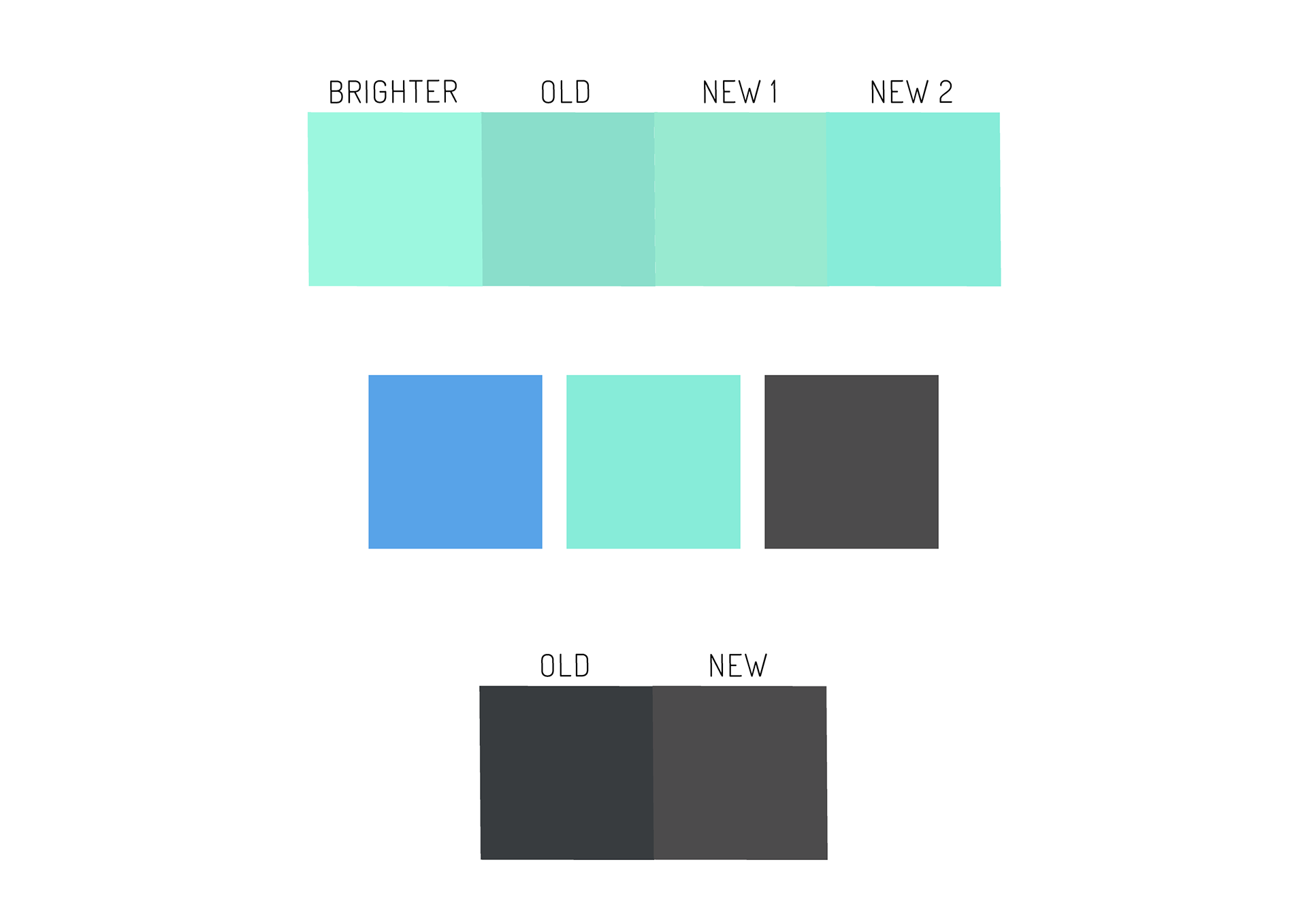
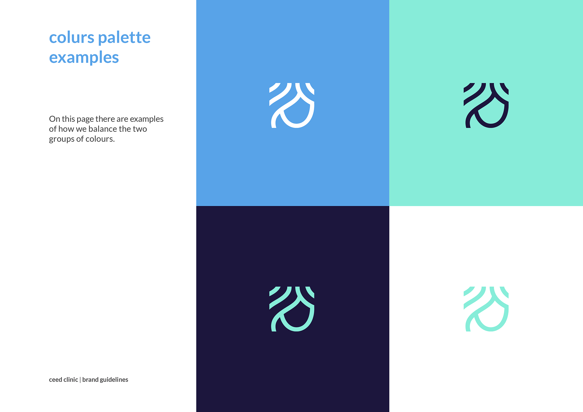
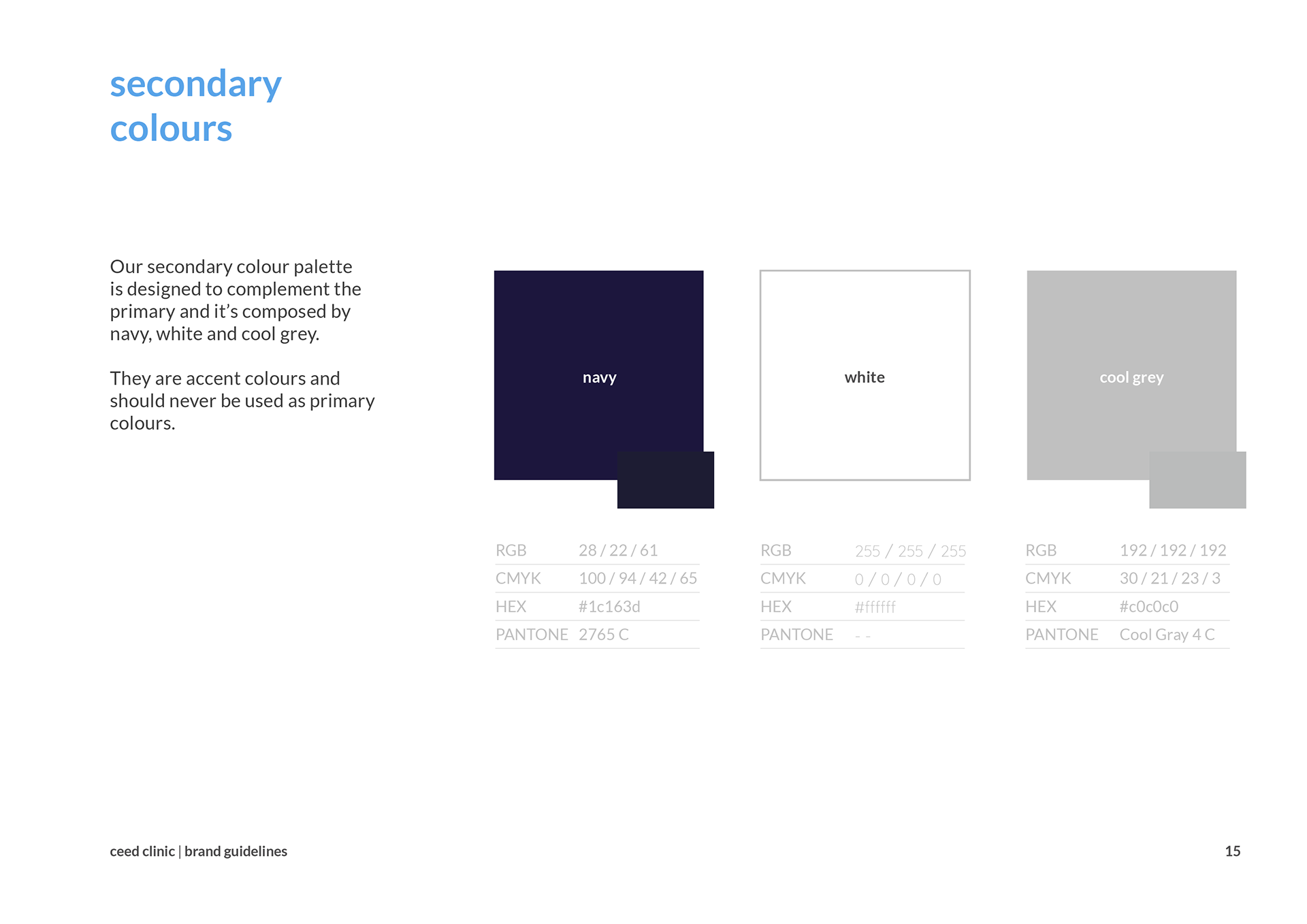
Introducing navy as additional supporting colour, the contrast with the bright cyan makes everything more vibrant and alive.
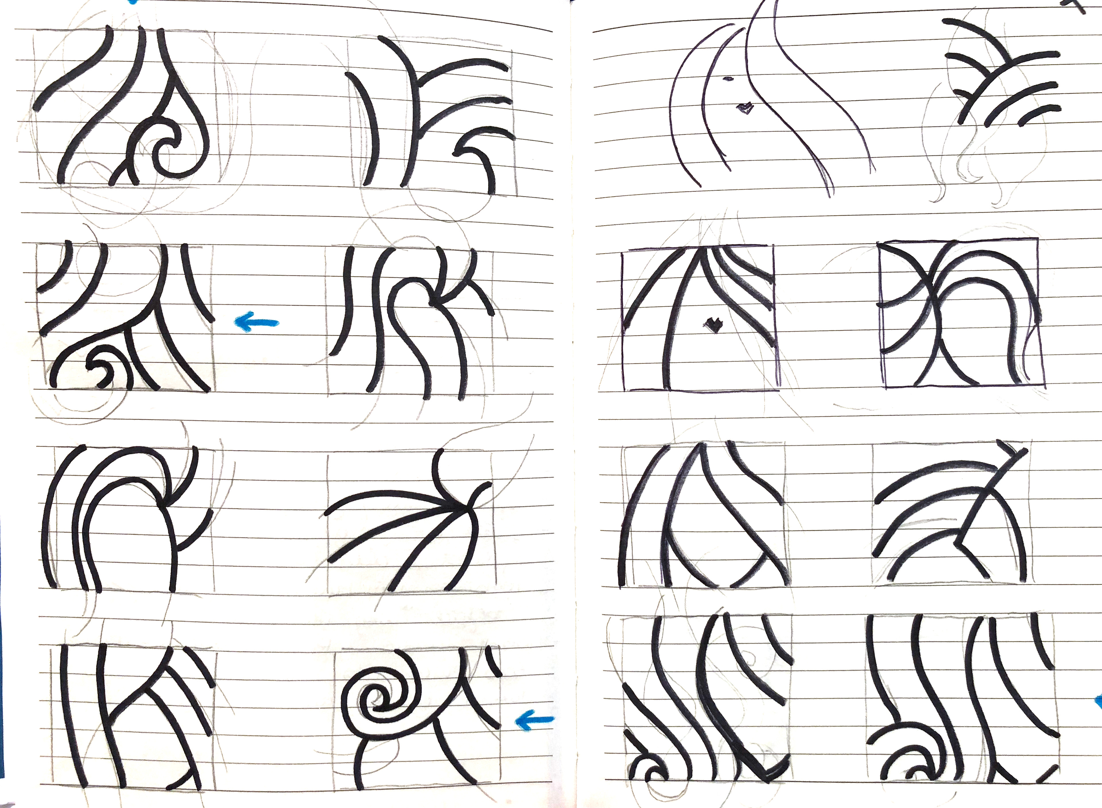
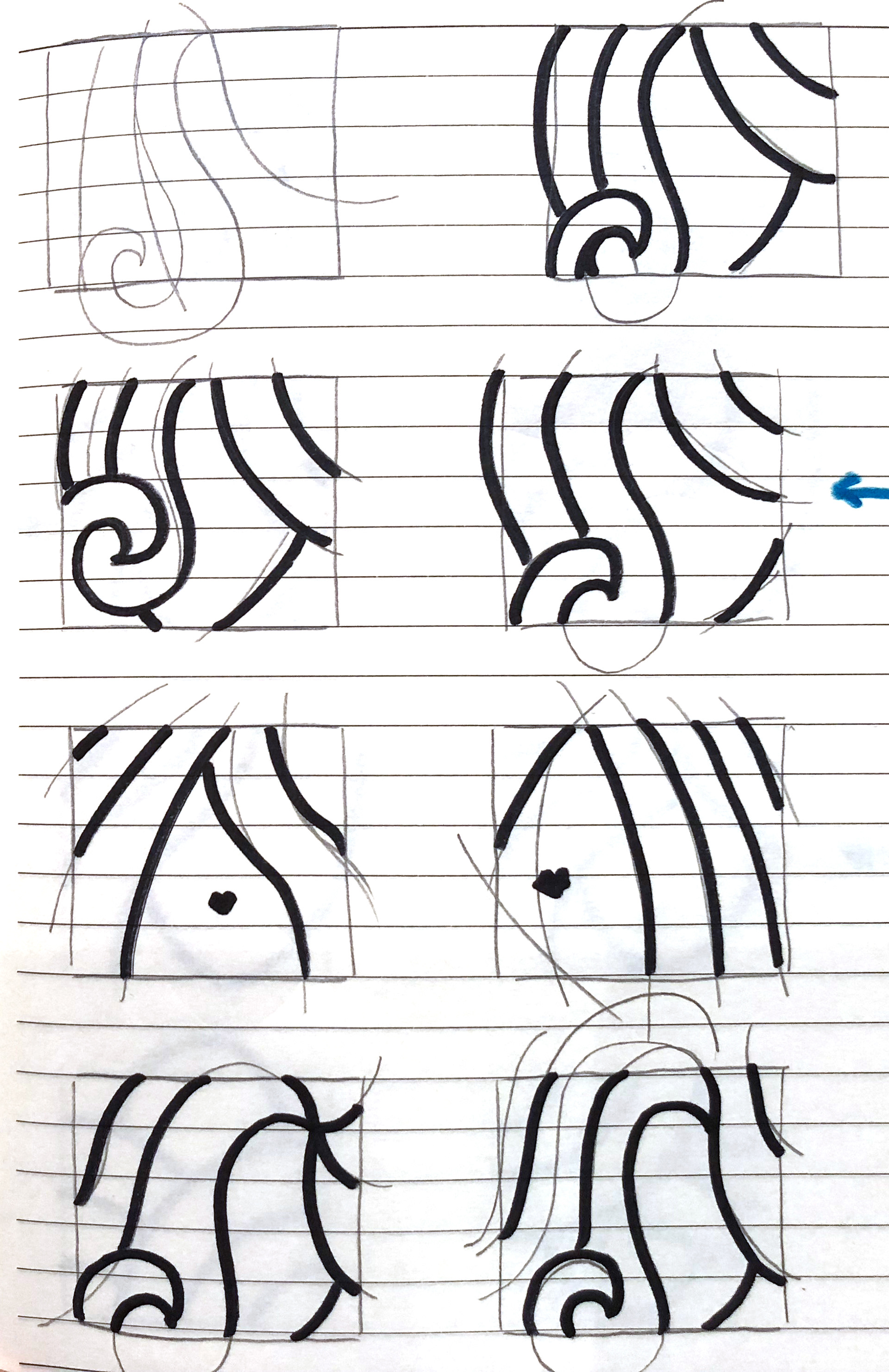
Redesigning the symbol
The symbol went through an additional design process in order to make it more 'hair related'. The main challenge was finding a design that could easily be recognisable without being too feminine. Although I'm a fan of simpler, more abstract designs, I worked with the client in order to develop drawings and find a new symbol that could be consistent with the whole new brand and approach
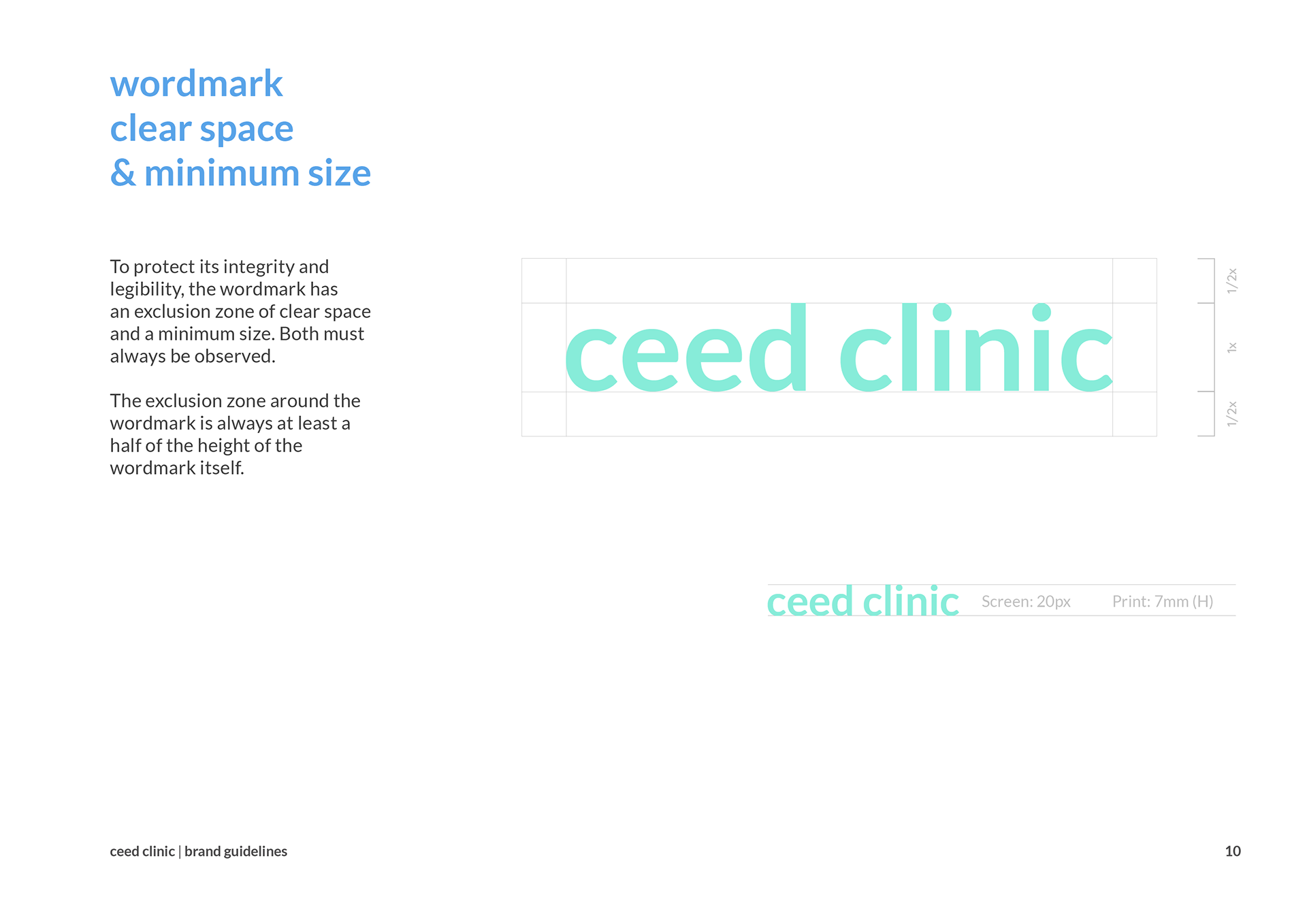
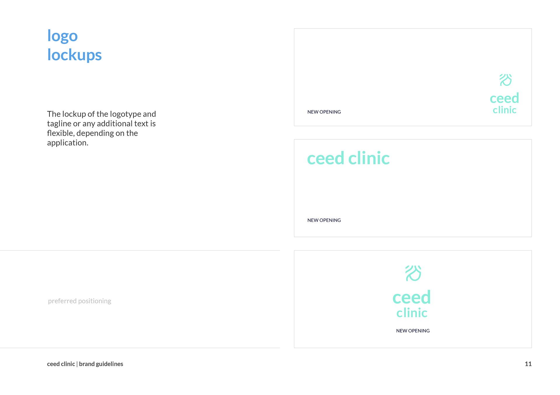
The full brand book is available here while the following images offer only a preview.